WebChart Control Sample - Data

Sample of using DataLabels
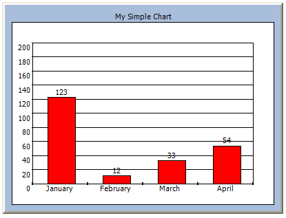
This sample shows:
- How you can display the values of the YValues on top of the actual point (in this case the column) using DataLabels. Of course you can change the format of the label as well as the background color and the border for the label that will be displayed using the properties of the DataLabel class.
- It also shows how you can set the maximum column width of a ColumnChart so it does not fills the whole space using MaxColumnWidth. This applies for each ColumnChart you add, so you can customize that some charts use more space than others.
- It finally shows how you can change the maximum value of the chart using YCustomEnd so that it will use this to scale the chart. You can also change the start point by using the YCustomStart to change it to not start from 0 (or the minimum value).
This is how the chart looks like, just copy/paste the code into notepad and save it as .aspx:
C# Code
<%@
Page Language="C#"
%>
<%@ Register TagPrefix="web" Assembly="WebChart" Namespace="WebChart" %>
<script runat=server>
public void Page_Load(object o, EventArgs e) {
ColumnChart chart = new ColumnChart();
chart.Data.Add(new ChartPoint("January", 123));
chart.Data.Add(new ChartPoint("February", 12));
chart.Data.Add(new ChartPoint("March", 33));
chart.Data.Add(new ChartPoint("April", 54));
chart.DataLabels.Visible=true;
chart.MaxColumnWidth = 40;
chartcontrol.Charts.Add(chart);
chart.Fill.Color=System.Drawing.Color.Red;
chartcontrol.RedrawChart();
}
</script>
<html>
<head />
<body>
<web:chartcontrol
BorderStyle="Outset"
ChartTitle-Text="My Simple Chart"
ChartPadding=30
YCustomEnd=200
HasChartLegend=false
id=chartcontrol
runat=server>
</web:chartcontrol>
</body>
</html>
Carlos Aguilar Mares © 2017